Exchange Rate Situational Exercises
Look at the graphs in the exercises below. Use the information there to answer the questions.
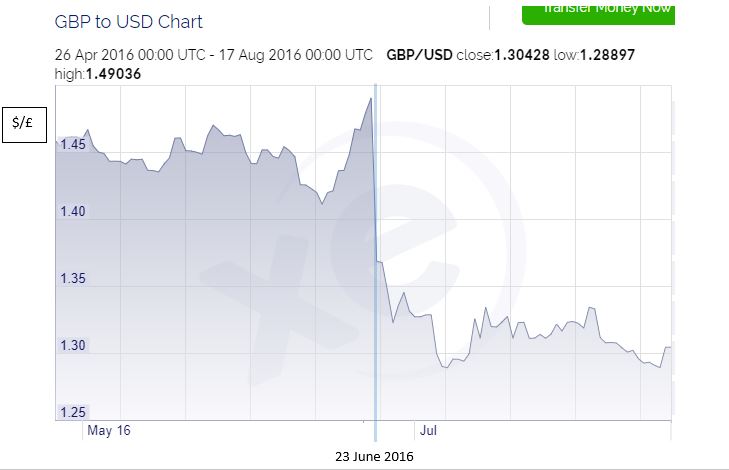
The people of the UK voted to leave the European Union on 23 June 2016. The graph above shows the exchange rate of USD to GBP.
Use an exchange rate diagram to explain why the exchange rate changed.
Source: www.xe.com/
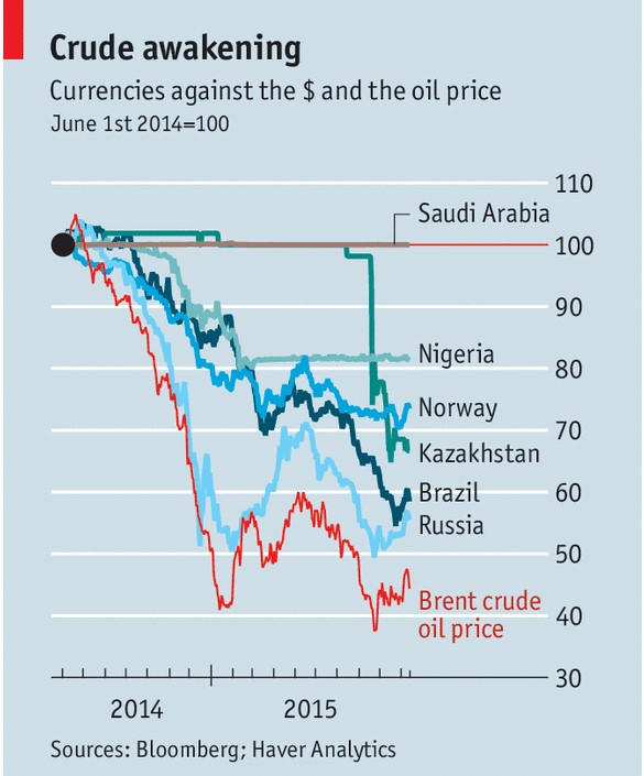
This graph shows the value of several currencies against the USD (in index form).
The graph also shows the price of Brent Crude Oil, the wholesale global market price for oil.
Each of the countries listed is an exporter of oil.
For a country of your choice, use an exchange rate diagram to explain why the exchange rate has changed.
Source: www.economist.com
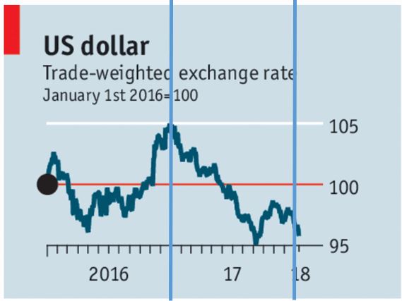
During 2017 there was strong growth in the global economy.
Interest rates rose in Canada and Britain.
The ECB and Japan’s central bank reduced their QE programmes.
Use an exchange rate diagram to explain what has happened to the USD in 2017.
Source: www.economist.com
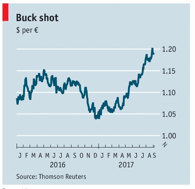
Consider the following facts about 2017:
- Marine Le Pen lost the French election, running on an anti-Euro platform.
- The Euro-zone economy showed strong signs of growth.
- People began to wonder if the ECB would push up interest rates.
- America’s economy has been growing by less than expected.
- America has been running a trade deficit, and Europe has been running a trade surplus.
Use an exchange rated diagram to explain what has happened to the Euro/Dollar exchange rate.
Soure: www.economist.com
Extension:
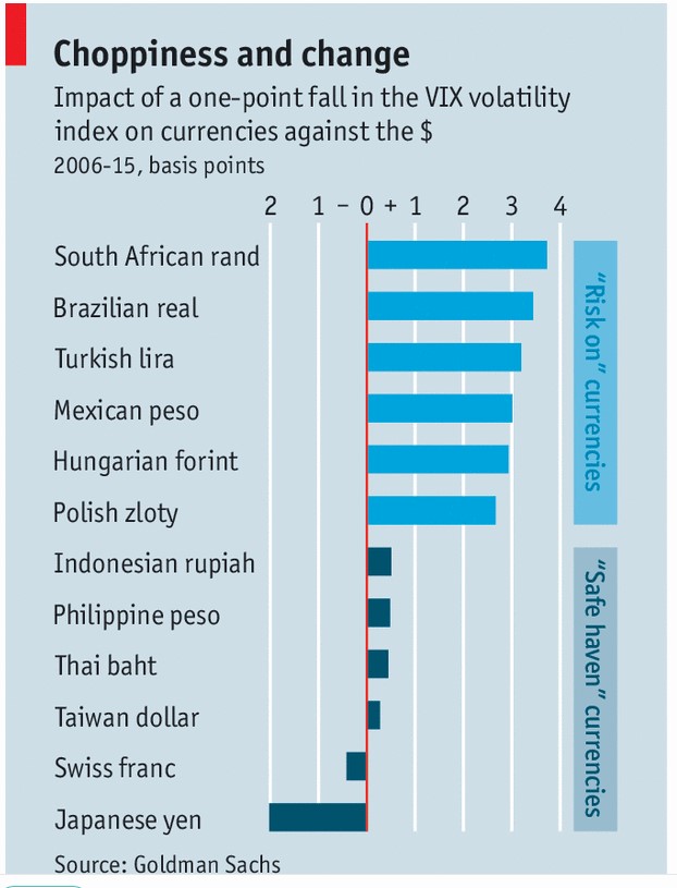
The VIX volatility index measures global investor fear.
Explain why changes in global investor fear will affect two different currencies (e.g. the Japanese Yen and the South African Rand